Australian bushfires: Misleading maps and photos spreading misinformation on social media
SINGAPORE — Social media has become a popular platform for people to raise awareness of the devastating fires that have engulfed Australia in recent months, but those who wish to share pictures and infographics about the blazes should think twice as they may be circulating false information.

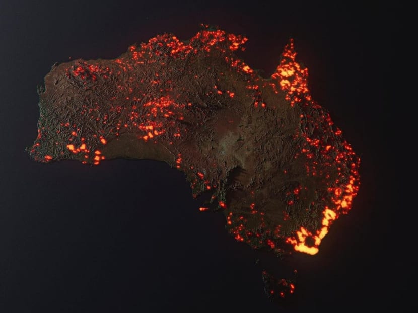
Artist Anthony Hearsey's visualisation of the Australian bushfires. The photo, which has been circulating on social media, has been wrongly interpreted as a live map showing the extent of the fires.
SINGAPORE — Social media has become a popular platform for people to raise awareness of the devastating fires that have engulfed Australia in recent months, but those who wish to share pictures and infographics about the blazes should think twice as they may be circulating false information.
Several fake or misleading pictures of the bushfires have gone viral on social media, the bulk of which are maps that do not accurately portray the extent of the blazes.
In other cases, users have circulated photos that are either heavily edited or are not from the current crisis.
One such photo, which shows a girl holding a koala in front of a wall of flames, has been debunked as a “photoshopped” image.
Another image, which shows a family clinging onto the side of a jetty shrouded in orange smoke, was actually taken during the Tasmanian bushfires in 2013.
While some of the manipulated images were shared by users with good intentions, the Australian Competition and Consumer Commission has warned that some scammers have taken advantage of the crisis to solicit funds from those seeking to help the victims affected by the fires.
"Scammers are cold-calling, direct messaging and creating fake websites and pages on social media to raise funds," the commission said in a statement.
ARTIST’S IMPRESSION MISTAKEN FOR LIVE MAP
In a post circulating on Twitter, a map which shows Australia covered in swathes of glowing orange embers has been wrongly interpreted as a live map showing the extent of the fires.
It is actually an artist’s visualisation of one month of data of locations where fires have been detected, collected by Nasa’s Fire Information for Resource Management System.
Responding to the criticism, the artist, Mr Anthony Hearsey, said in an Instagram post that the scale of the fires in the graphic appears to be exaggerated due to the render’s glow.
“But it is generally true to the information from the Nasa website,” he said, adding: “Think of this as (a) prettier looking graph”.
Instagram has since placed a warning on the image which states that the photo contains false information.
MAPS CONTAINING MISINFORMATION
Several misleading maps have also gone viral on social media.
One widely shared map, taken from the Australian government website MyFireWatch, was said to show all the fires burning across the country.
However, according to the website, the data actually incorporates “any heat source that is hotter than its surroundings” which could include gas flares, refinery furnaces or highly reflective industrial roofs.
This means that the symbols are not guaranteed to indicate actual fires. They also do not reflect the actual size of the blazes and how dangerous they are.
Other maps wrongly identified the hotspots. A map used by American news agency ABC, for example, showed the entire Australian east coast on fire, as well as a stretch of fires in the centre of the country.
Another map wrongly showed the blazes concentrated on the west coast of Australia.
In some instances, maps of Australia were overlaid on maps of the United States or Europe in attempts to visually represent the scale of the blazes.
Experts have pointed out, however, that such flat map projections are not entirely accurate due to the Earth’s curvature.
Users have been advised to consult the live maps published by the New South Wales Rural Fire Service as they contain details such as the risk posed by the fires and whether they are under control.
THINK TWICE BEFORE SHARING
Dr Julie Posetti, global director of research for the International Centre for Journalists, told Australian news agency SBS News that those affected by the fires, and who are relying on online information, should stick to accurate and trustworthy sources.
She added that while it is understandable that there has been a demand for geographic representations of the scale of the crisis to help international audiences understand the gravity of the disaster, Dr Posetti stressed that it needs to be done properly.
Meanwhile, Ms Stephanie Hunt, the Australian editor of Storyful, an outlet which sources, verifies and analyses social media content for local and international news outlets, said that members of the public should think twice about where an image comes from before sharing it on social media.
Users should do a Google image search if something looks too good to be true, she added. AGENCIES


