#trending: 'Auntie' or 'classic'? Charles & Keith debuts new emblem, drawing mixed reactions from netizens
SINGAPORE — Homegrown label Charles & Keith recently took the leap to redesign its logo after almost 30 years, unveiling it alongside a brand new emblem and monogram that will soon be commonplace in all stores.
 recently launched by Singaporean fashion brand Charles & Keith has stirred up controversy among fans and online users.")
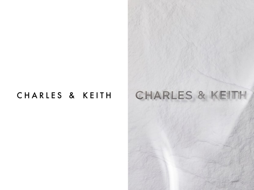
A new emblem (left) recently launched by Singaporean fashion brand Charles & Keith has stirred up controversy among fans and online users.


This audio is AI-generated.
- After 28 years, Singapore fashion label Charles & Keith unveiled a redesigned logo, emblem and monogram early in 2024
- They will be used across different products starting from its Spring 2024 line
- The new design has drawn mixed reactions, with some people calling it "auntie" and "gaudy"
- Fans have also complained about Charles & Keith's apparent shift towards monogramming
- The brand was previously known for its simplicity and for hiding its logo


SINGAPORE — Homegrown label Charles & Keith recently took the leap to redesign its logo after almost 30 years, unveiling it alongside a brand new emblem and monogram that will soon be commonplace in all stores.
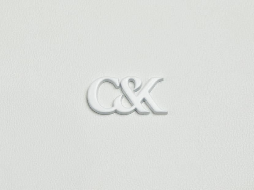
Compared to its original logo, the redesign uses a slightly blockier font with a much narrower kerning. The emblem, which the brand has named L'initial, uses a serif font for its initials with the "C", "K" and ampersand characters flowing into one another.
The new designs debuted on Jan 19 on the brand's Facebook and Instagram accounts, where fans responded with approval and excitement for the new L'initial emblem.
One Instagram user wrote: "Can't wait to try (the) new collection with this logo."
Others, though, were unimpressed, calling it "too basic" and "a Calvin Klein redesign". American fashion house Calvin Klein is known for its long-established monogram, the "ck" emblem.
Now that Charles & Keith's L'initial product line has made it to physical stores, it seems that the critics are only growing.
A TikTok video posted by user "deedoodum" last Saturday (March 9) shows the wallets, bags and shoes in a Charles & Keith store adorned with the new emblem.
The text on the video reads: "I hope you get all your Charles & Keith stuff soon because this rebrand is not it."
As of Thursday afternoon, the video has had 867,100 views, 31,700 likes and 470 comments.
The phrase "Charles and Keith old logo" is also trending on the short-video platform.
A top comment on TikTok joked: "Charles & Keith looks like those brands that try to look like Charles & Keith."
Another lamented: "Why is it so gaudy looking?"
Similarly, many TikTok users felt that it was "giving auntie" and "makcik vibes", meaning that it has matronly traits and appealed to middle-aged women.
They also compared it to Bonia, another fashion retailer here which, before its own recent rebranding, was known for being an "auntie brand" with Louis Vuitton-esque monogrammed leather bags.
However, some people stood up for the brand, writing: "It's a classic theme! That doesn't mean you're an auntie if you like it. Everyone has different tastes."
One TikTok user said: "I actually love these, eh. Am I an auntie?"
Online users also questioned why Charles & Keith had decided to move away from its previous designs despite its popularity.
In the past, the brand's shoes have been seen on members of K-pop girl groups Blackpink and NewJeans.
One comment went: "It was known for its up-to-date designs before and everyone loves it. Why suddenly bother being classic and boring? Don't fix something that isn't broken."
Fans were similarly disappointed by the apparent shift towards monogramming, writing: "Oh, is it marking all the items with its logo? But I love its simplicity."
Agreeing, another said: "I like to buy (from Charles & Keith) because it hides the logo."
In a press release on Jan 24, the brand's founders Charles Wong and Keith Wong said: "We are excited to start a new chapter and present the redesigned logo in tandem with our first-ever emblem and monogram.
"Each element was thoughtfully designed, an ode to our beginnings with the inclusion of our initials, the ampersand reflecting the brand’s natural duality."
TODAY has reached out to Charles & Keith Group for comment.
Related topics
charles & keith TrendingStay in the know. Anytime. Anywhere.

Subscribe to our newsletter for the top features, insights and must reads delivered straight to your inbox.
By clicking subscribe, I agree for my personal data to be used to send me TODAY newsletters, promotional offers and for research and analysis.